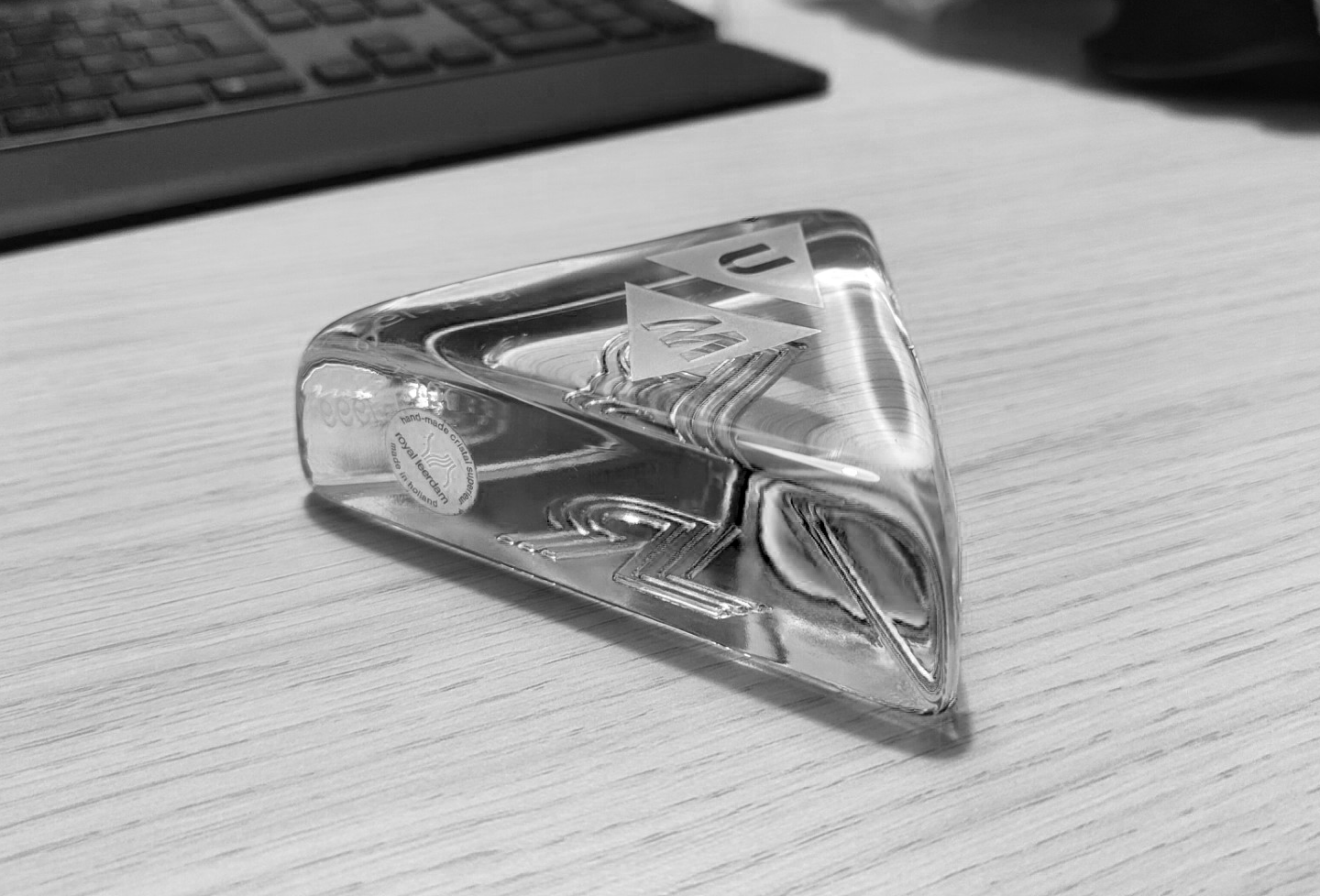
For many years, Maastricht University gifted glass paperweights to employees celebrating retirement or a jubilee. The earliest editions were commissioned in the early 1980s from the renowned Dutch glassmaker Royal Leerdam. Amid the economic challenges of the time, the Executive Board requested high-quality glass instead of crystal, citing the university’s “severely limited resources” (Van den Biggelaar, 1982).

The UM Paperweight
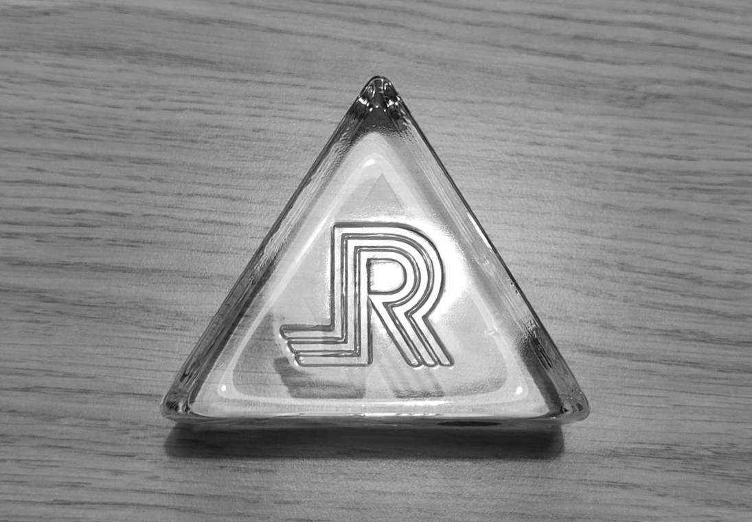
According to Zwegers (forthcoming), the paperweight represented more than gratitude for service. It became a quiet marker of continuity and identity in a period of institutional change. While the material remained constant, the engraved logos evolved. Initially bearing the emblem of Rijksuniversiteit Limburg, the design changed after the university adopted the name Universiteit Maastricht in 1996 (since 2008 officially Maastricht University). For a time, both logos appeared side by side, capturing a moment of transition and layered institutional meaning.

Rijksuniversiteit Limburg Logo on the UM Paperweight
As a material object, the paperweight links everyday university life to broader historical shifts. It reflects the evolution of Maastricht University, from its early years to its rebranding and international growth. What began as a token of appreciation has become a subtle but enduring reminder of change, belonging, and the value of long-term commitment to the university.